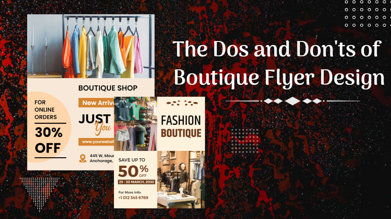
Welcome to a comprehensive guide on the dos and don’ts of boutique flyer design! In this article, we will provide you with valuable insights and tips to create stunning and effective boutique flyers that will captivate your target audience. Whether you’re a boutique owner, a marketing professional, or someone looking to promote a boutique event, understanding the key elements of flyer design is crucial for success. Get ready to explore a treasure trove of boutique flyer ideas and strategies to help your boutique soar above the competition.
Understanding the Power of Boutique Flyer Design
Boutique flyers are an essential tool for showcasing your unique boutique and enticing potential customers. With the right design elements, you can communicate your brand’s personality, highlight your products or services, and generate buzz around your boutique. A well-designed flyer has the potential to attract attention, create a memorable impression, and ultimately drive foot traffic to your boutique.
Also Read: Incorporating Color Psychology in Boutique Flyers
The Dos of Boutique Flyer Design
1. Define Your Objective
Before you start designing your boutique flyer, clearly define your objective. Determine whether you want to promote a sale, announce a new collection, or invite people to an exclusive event. By understanding your objective, you can tailor your flyer design to effectively convey your message.
2. Know Your Target Audience
Understanding your target audience is vital when designing a boutique flyer. Consider the demographics, interests, and preferences of your potential customers. This knowledge will help you choose the right color schemes, fonts, and imagery that resonate with your audience and make your flyer more appealing.
3. Keep It Simple and Clear
A cluttered flyer can confuse and overwhelm readers. Instead, opt for a clean and minimalistic design that allows your message to shine. Use concise and persuasive language, and ensure that your key information, such as the boutique name, location, contact details, and event date, are prominently displayed.
4. Choose Eye-Catching Images
Visuals play a significant role in boutique flyer design. Select high-quality images that reflect your boutique’s style and evoke emotion. Showcase your best products or portray happy customers enjoying their shopping experience. Remember to use images that are relevant to your objective and resonate with your target audience.
5. Utilize Compelling Headlines and Subheadings
Craft compelling headlines and subheadings that grab attention and entice readers to continue reading. Use keywords related to your boutique, such as “boutique flyer ideas,” to optimize your flyer for search engines. Incorporate powerful words that create a sense of urgency or exclusivity, encouraging potential customers to take action.
6. Highlight Benefits and Special Offers
Clearly communicate the unique benefits your boutique offers, whether it’s personalized customer service, exclusive designer collections, or limited-time promotions. Highlight any special offers, discounts, or rewards to incentivize readers and encourage them to visit your boutique.
7. Maintain Consistent Branding
Consistency is key to establishing a strong brand presence. Ensure that your boutique flyer aligns with your brand’s visual identity, including your logo, color palette, and typography. Consistent branding builds recognition and trust among your target audience, making your boutique more memorable.
The Don’ts of Boutique Flyer Design
1. Avoid Cluttered Layouts
Cluttered layouts can confuse readers and diminish the effectiveness of your flyer. Avoid cramming too much information onto a single page. Instead, prioritize essential details and use white space strategically to enhance readability and visual appeal.
2. Steer Clear of Generic Templates
While templates can be convenient, using generic designs can make your boutique flyer blend in with the crowd. Stand out by customizing your flyer with unique graphics, fonts, and layouts that represent your boutique’s individuality. Consider hiring a professional graphic designer for a polished and personalized touch.
3. Don’t Overdo the Text
Long paragraphs of text can be overwhelming and discourage readers from engaging with your flyer. Keep your copy concise and impactful. Use bullet points, short sentences, and bold headings to break up the content and make it easy to scan.
4. Avoid Inconsistent Typography
Using too many fonts or conflicting typography styles can create visual chaos and undermine the professionalism of your boutique flyer. Stick to a maximum of three fonts that complement each other and maintain readability. Choose fonts that reflect your brand’s personality and align with your target audience’s preferences.
5. Don’t Neglect Call-to-Action
A strong call-to-action (CTA) is essential to guide readers toward the desired action. Whether it’s visiting your boutique, subscribing to a newsletter, or making a purchase, make sure your CTA stands out and clearly communicates what you want your audience to do.
Conclusion
Designing an effective boutique flyer is a blend of creativity, strategic thinking, and understanding your target audience. By following the dos and avoiding don’ts outlined in this article, you’ll be well on your way to creating attention-grabbing boutique flyers that drive traffic and boost your boutique’s success. Remember, your flyer is a representation of your boutique’s unique personality and offerings, so make it shine!


